Showing posts with label interactive visualisation. Show all posts

Monday, 4 November 2024

Plotting indices with divergent colour schemes

Many diversity indices have numerical distributions that are divergent, i.e. they are centred on some value and the interesting bit is the magnitude of the differences away from that value.  A simple example is z-scores, where the data are centre on a value of zero and the values indicate how many standard deviations above or below the expected value the input data are.   These have been plotted using a divergent scheme since version 4.1, as described here.

However, one can also have indices that are simple differences, and also ratios where 1 is the centre of the distribution, and values of 1/2 and 2 are the same magnitude difference from the centre.  The relative phylogenetic diversity and endemism indices are examples of the latter.  

From version 5, Biodiverse plots difference and ratio indices using a divergent colour scheme.    These use the same colour range as the z-scores but plotted along a continuous scale instead of as ordinal classes.  

The colouring happens automatically based on metadata stored with the indices (incidentally, the much of GUI is built using this metadata).  

Colours are also scaled so the most extreme "high" colour is equivalent to the most extreme "low" colour, i.e. if the range of difference values is -5 to 1 then the colours are assigned to the range -5 to 5, and the same for -1 to 5.  This is also accounted for when the data are log scaled or percentile trimmed to de-emphasise extreme values.  

A useful point to note is that the colour schemes can be flipped, so if one prefers blue as extreme positive values then this can be done under the Map menu at the left of the display.  

An example is below to compare the old behaviour with the new.  


Prior to version 5, ratio data were plotted using the same colour scheme as any other data, making it difficult to interpret the relative magnitude of the index values across cells.  These are the Relative Phylogenetic Diversity results for the Acacia data set of Mishler et al. (2014), scaled to emphasise the inner 90% of the distribution (i.e. the upper 5% are assigned the same colour, so too the lower 5%).  This is the interval [0.406, 0.896], which means red cells include ratios <1 which is not ideal.  Compare with the next figure.    


The same data as in the previous figure, but now using a divergent colour scheme.  Biodiverse knows this is a ratio index, so assigns colours accordingly.  Red cells have ratios exceeding 1, blue cells less than 1.  Ratios close to 1 are in yellow.  The colours are assigned to the interval [0.406,2.463], where 2.463=1/0.406.  This means one can be sure red cells have ratios exceeding 1, and there is less chance of misinterpreting the results.  


It is not shown here, but the metadata is also stored for tree-based indices so divergent colours are assigned to the tree branches where appropriate.  More details about that process are in this post.  


----

Shawn Laffan

04-Nov-2024


For more details about Biodiverse, see http://shawnlaffan.github.io/biodiverse/  


For a list of some of the analyses Biodiverse has been used for, see https://github.com/shawnlaffan/biodiverse/wiki/PublicationsList 


You can also join the Biodiverse-users mailing list at https://groups.google.com/group/Biodiverse-users or start a discussion at https://github.com/shawnlaffan/biodiverse/discussions 


GUI: Polygon overlays (and underlays)

Since its first release, Biodiverse has supported plotting of polygon and polyline feature class data (from shapefiles).  The support is very basic given users can only plot the outlines of polygons, even though the colours could be changed.  

This has worked well overall, but there are times when the linework from the feature data gets in the way of the cells being plotted.  There are also times when it is useful to plot polygons as solid fills instead of just as the outline.  From version 5 of Biodiverse it is possible to do just this.  

The process is relatively simple.  If a polygon overlay is loaded then it is listed twice in the selection window, once for lines and once for solid fill (with no outline).  The default choice is polylines, which is the current behaviour.  Users then have the option of plotting one overlay above or below the cells.


Colours can be assigned in the usual way.  In this next selection window, the polygon data will be displayed below the cells using a grey colour (grey is quite useful as it does not visually dominate when coloured cells are used).  


Polygon data are displayed as a solid grey fill, under the cells.  In this case it makes it more obvious where there are unsampled regions.  (Cell outlines have also been turned off using the map menu).


Other uses for polygon overlays are in plotting ocean polygons over terrestrial cells to cover over parts of cells that are in the sea (and vice versa for marine data).  


There is no doubt more work to be done, for example plotting more than one layer at a time, but it is a useful improvement.  If more complex plotting is needed then this is when it is best to leverage the power of GIS software.  


----

Shawn Laffan

04-Nov-2024


For more details about Biodiverse, see http://shawnlaffan.github.io/biodiverse/  


For a list of some of the analyses Biodiverse has been used for, see https://github.com/shawnlaffan/biodiverse/wiki/PublicationsList 


You can also join the Biodiverse-users mailing list at https://groups.google.com/group/Biodiverse-users or start a discussion at https://github.com/shawnlaffan/biodiverse/discussions 


Saturday, 3 February 2024

Tree panels: colour the tree using any list from spatial outputs across the project

It has long been possible to colour the tree branches in the spatial tab.  However, it was only possible to use a list from the spatial analysis being plotted.  

From version 5 the interface has been changed to enable selection of any list from spatial outputs across the project.  Where before the system had a simple drop down list, it is now a menu with submenus for each basedata and then each of its spatial outputs. 


The tree colour list selection is now a menu that allows users to choose any list across all spatial outputs in the project 

As with most widgets in the GUI, the menu entries are described in the tooltip.  That text is duplicated below.  

The first (default) option shows the paths connecting the labels in the neighbour sets used for the analysis. When there is one such set all branches are coloured blue. When there are two such sets blue denotes branches only in the first set, red denotes those only in the second set, and black denotes those in both. From these one can see the turnover of branches between the groups (cells) in each neighbour set.

The next set of menu options are list indices in the spatial output that belongs to this tab.  The remainder are lists across other spatial outputs in the project, organised by their basedata objects.  These are in the same order as in the Outputs tab.  Basedatas and outputs with no list indices are not shown.

If a branch is not in the list then it is highlighted using a default colour (usually black).  If the selected output has no labels that are also on the tree then no highlighting is done (all branches remain black).

Right clicking on a group (cell) fixes the highlighting in place, stopping changes to the branch colouring as the mouse is hovered over other groups.  This allows the tree to be exported with the current colouring (another new option in version 5).

----

Shawn Laffan

03-Feb-2024


For more details about Biodiverse, see http://shawnlaffan.github.io/biodiverse/  


For a list of some of the analyses Biodiverse has been used for, see https://github.com/shawnlaffan/biodiverse/wiki/PublicationsList 


You can also join the Biodiverse-users mailing list at https://groups.google.com/group/Biodiverse-users or start a discussion at https://github.com/shawnlaffan/biodiverse/discussions 


Tuesday, 7 February 2023

Plotting z-score indices and randomisation results

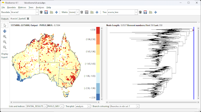
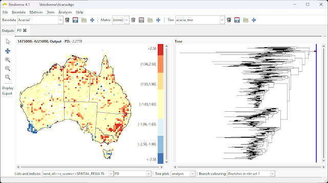
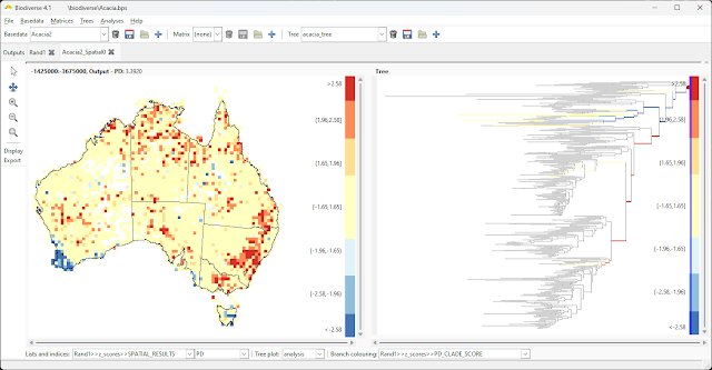
From version 4.1, Biodiverse will plot indices it knows are z-scores using a divergent colour scheme, with values classified into intervals (adapted from the ArcGIS implementation).  This makes it much easier to see which locations are potentially significant given the expected values.

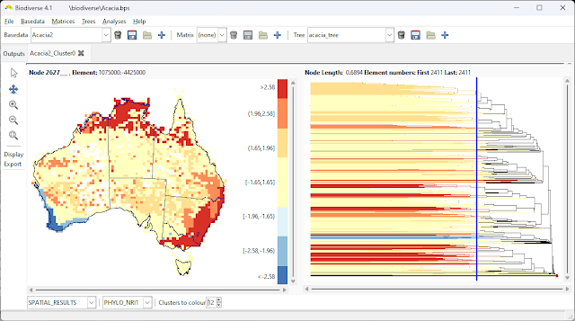
This process applies to indices like the Net Relatedness Index and Net Taxon Index, all of the Gi* indices such as for group properties and label properties (more on such analyses here), as well as the z-scores generated by randomisation analyses.  It also applies to branches of a cluster dendrogram when indices have been calculated for each node/branch.  

You can export the coloured images to geotiff in the same way as for any data set.

There is not much more to it than that, so here are some images of what it looks like for a spatial analysis using the Acacia data set of Mishler et al. (2014).  


The Net Relatedness Index


Z-scores for Phylogenetic Diversity after a spatial randomisation process


Net Relatedness Index calculated for the groups (cells) under each branch of a cluster analysis. Coloured cells are associated with the dendrogram branches that intersect the blue slider bar.


The spatial distribution of PD significance (left) with branches occurring in a cell in south-west Western Australia (black dot) coloured by clade score significance against the same randomisation process.


----

Shawn Laffan

07-Feb-2023


For more details about Biodiverse, see http://shawnlaffan.github.io/biodiverse/  


For a list of some of the analyses Biodiverse has been used for, see https://github.com/shawnlaffan/biodiverse/wiki/PublicationsList 


You can also join the Biodiverse-users mailing list at https://groups.google.com/group/Biodiverse-users or start a discussion at https://github.com/shawnlaffan/biodiverse/discussions 


Tuesday, 25 October 2022

Biodiverse now calculates CANAPE for you

The CANAPE protocol is one of the analyses Biodiverse is most commonly used for (see examples amongst the list of publications using Biodiverse).  

The method, or protocol, was originally described in Mishler et al. (2014) and is conceptually simple.  Run an analysis that includes phylogenetic endemism and relative phylogenetic endemism, run those through a randomisation, and then categorise the results based on the significance score of the indices.  This process is described in more detail in previous posts here and here.  

The main issue with the approach to date is that the CANAPE classes are determined outside of Biodiverse using systems like a GIS, R code or a spreadsheet.  So while the process is conceptually simple, the actual implementation can all get a bit complex. Many users are not entirely sure which indices to pass through their functions, or even which lists to extract them from.  

As of Version 4 Biodiverse now calculates it for you.  This occurs automatically whenever an analysis has included the Phylogenetic Endemism and Relative Phylogenetic Endemism type 2 calculations.   (If you want it sooner than version 4 then it is in the development release 3.99_005, which was current at the time of writing.  See the downloads page for links).


Biodiverse now calculates the CANAPE scores when the requisite indices have been calculated, and a randomisation has been run.  Like many of the posts on this blog, this example uses the Acacia data set from Mishler et al. (2014).

How does Biodiverse store the results? 

The results are stored in a new list where the name is the randomisation output used followed by ">>CANAPE>>".  So for a randomisation called "rand" you would see "rand>>CANAPE>>".  The use of angle brackets might look a bit strange at first but makes the naming consistent with the other randomisation lists and simplifies the underlying code.

The CANAPE classes are stored in an index called CANAPE_CODE, with a numeric code indicating which of the categories a cell falls in.  Currently this code is 0 for not significant, 1 for neo-endemism, 2 for palaeo-endemism and 3 for mixed endemism.

Biodiverse also provides individual indices for neo, palaeo and mixed in the event a user only wants to see which cells are are in a specific class.  For example one might want to run a cluster analysis using only neo-endemism cells following the process described here.  


The same data as above but highlighting Palaeo-endemism cells in red.  All other cells containing data are in blue.  


Visualisation

A big advantage of generating CANAPE results within Biodiverse is that users can now explore the results using the functionality Biodiverse provides.  As an example, the next screen shot shows an exploration of the contribution of each clade on the tree in relation to the analysis groups (cells) (see more details about that process here and here).  

Each tree branch is coloured by the relative contribution of the clade subtending it to the PE score in the cell being hovered over (black dot in south-western WA).  This allows an understanding of which clade is driving the PE scores, and thus CANAPE, in a cell.  The visualisation process is explained in more detail here.  


Displaying the results in other systems

If you then want to use the plots as part of a map then they can be exported to an RGB Geotiff.  Details of how to do this are in another post but the next two screenshots show the start and end.  


What about a different colour scheme?


The colour scheme used is from Mishler et al. (2014) where neo is red (new is hot), palaeo is blue (old is cold) and purple is between blue and red on a colour wheel.  

If you prefer a different colour scheme then you can export the data as you normally would, for example as CSV files or as non-RGB geotiffs, and recreate the plot to your own tastes.  

Changing the colours within Biodiverse would be very useful and contributions are always welcome.

What about the Super class?  


The system does not currently generate the Super class.  It can be added if there is demand.  (Edit: It was added for Biodiverse Version 5).

Do I have to run a new randomisation analysis to see the CANAPE list?  


The CANAPE lists are generated at the end of any sequence of randomisations.  If you already have a randomisation analysis then they can be created by running one additional iteration.  

If you are concerned that your analysis is already at 999 iterations then all you lose is a bit of numeric neatness as there are now 1001 realisations in total instead of 1000 (one original plus all the random ones).  This is unlikely to make any meaningful difference once that many iterations have been run.

--------

Shawn Laffan

25-Oct-2022


For more details about Biodiverse, see http://shawnlaffan.github.io/biodiverse/  


To see what else Biodiverse has been used for, see https://github.com/shawnlaffan/biodiverse/wiki/PublicationsList 


You can also join the Biodiverse-users mailing list at https://groups.google.com/group/Biodiverse-users or start a discussion at https://github.com/shawnlaffan/biodiverse/discussions 


Saturday, 22 December 2018

Visualise matrices of spatial turnover

A long standing feature in Biodiverse is the ability to interactively visualise spatial patterns of turnover.  This was described in Laffan (2011), but without detailed instructions for how to generate the data.

This blog post provides a few more details, as well as a video showing how to visualise and export the data.  Exported data can be used in, for example, NMDS analyses to relate turnover to environmental patterns (see González-Orozco et al. 2013 and González-Orozco et al. 2014).

One thing to note is that if you have a phylogeny selected then you can view which branches of the tree are shared or differ between the index and neighbour group (cell).  This is evident in the video, and is described in an earlier blog post: https://biodiverse-analysis-software.blogspot.com/2014/10/new-tree-plots-in-biodiverse.html 


1.  Generate the data


If you only want to build the matrix (or matrices) then select this option. 

2.  View the matrices

[Update 2019-01-29]  The matrix can be viewed by opening it from the Outputs tab.  The default display from the cluster analysis is the dendrogram and its associated spatial plot.

Notice the regions that become evident depending on which cells are selected.  For example, cells in South-West Western Australia are strongly related to other cells in that region, cells in Northern Australia are related across part of the top-end, while those in Tasmania extend into Victoria.


3.  Export the data


Exporting of the data is via the Export menu at the left.  It can also be done using the export button in the Outputs tab when the matrix is selected.

Currently only delimited text is supported, but you can choose whether to use normal, sparse or GDM compatible output formats.  Hovering over the options gives more details about what they do.  


Shawn Laffan

22-Dec-2018


For more details about Biodiverse, see http://shawnlaffan.github.io/biodiverse/


To see what Biodiverse has been used for, see https://github.com/shawnlaffan/biodiverse/wiki/PublicationsList


You can also join the Biodiverse-users mailing list at http://groups.google.com/group/Biodiverse-users or follow the google plus page:  https://plus.google.com/+BiodiverseSoftware


Thursday, 23 August 2018

Cluster analyses - export coloured GeoTIFF of the map to match the tree branch colours

One of the features of Biodiverse that gets the most positive feedback is the ability to colour the branches of a cluster dendrogram and then have the map show the same colours.  This makes it very easy to see where a selected cluster is, and how the clusters map spatially,

Up until now, however, it has been difficult to replicate the display without resorting to screenshots and their attendant issues with resolution (and sometimes apparent JPEG compression).

While one has been able to export the colours with the tree since version 2 was released, there was no option to match the spatial data.  With the release of version 2.1, that is now an option for the Nexus tree exports - there is a new option to export a geotiff file with associated colourmaps that can be used in GIS software.

Some images will show it best.  Below are steps to export the data and then to display it in ArcMap or in QGIS.

Note that the process works for continuous as well as discrete colour schemes.  Whatever colours were last displayed are what will be used.

This is also the process used to generate Figure 6 in Link-Pérez & Laffan (in press).

Exporting the data


An example cluster dendrogram with the associated spatial data.  It is easy to see the spatial distribution of the various clusters.  

The Nexus format is needed to export the coloured tree and geotiff, 

Be sure to select the geotiff option to get the spatial data.  If you want the tree colours as well then check that option too ("Export colours").


Displaying it in ArcMap

You need only add the raster to a data frame, as ArcMap looks for the colourmap automatically (as does ArcGIS Pro if you are using that).

ArcGIS will automatically see the colourmap file and display the colours as they were in Biodiverse.  

You can use FigTree to export the coloured tree to a PNG.  

...and display this tree in an ArcMap layout.  Note that the resolution can be an issue and you also have to convert the background to be white instead of transparent, but it often works well enough and images can be resampled to a higher resolution using most editing packages.  


Displaying it in QGIS

The QGIS process involves some manual loading of files via the layer properties dialogue.


In the Style section, set the Render type to be Singleband pseudocolor, then choose the folder icon to "load color map from file".  For a nexus file called example.nex, the colourmap file will be called example.nex.txt.   

And there it is, a display with the same colours as in Biodiverse.  


Shawn Laffan
23-Aug-2018


For more details about Biodiverse, see http://purl.org/biodiverse 


To see what Biodiverse has been used for, see https://purl.org/biodiverse/wiki/PublicationsList


You can also join the Biodiverse-users mailing list at http://groups.google.com/group/Biodiverse-users or follow the google plus page:  https://plus.google.com/+BiodiverseSoftware


Tuesday, 19 September 2017

Log scale your map displays

In Biodiverse version 2 you will be able to log scale the colour stretch on the map.  This is a pretty minor change in some ways, but does allow much better visualisations of results when the distributions are highly left skewed.

The Spatial and Cluster tabs have a legend option to allow you to turn it on or off.

The View Labels tab currently switches between log and linear scaling depending on the maximum value and the maximum possible value.  It will use log scaling when there are more than 20 labels to highlight or the the maximum value across highlighted cells is less than 0.8 times the number of selected labels.  Otherwise it will use a linear scaling (so if there are 20 selected labels, but no cell contains more than 16 then it will log scale the display).


Here is a video to demonstrate the process.  The first part shows a matrix visualisation of a Region Grower analysis (a simple pair-wise complementarity analysis, in this case using richness as the index).  It is much easier to see the spatial patterns when the colour stretch is log scaled.  The second shows a spatial analysis.  In this case the log scaling does not make too much difference.  The third shows the view labels tab.  Note that the log scaling makes it  much easier to see an entire clade on a tree, as previously the colours would have been washed out.


Shawn Laffan
19-Aug-2017


For more details about Biodiverse, see http://purl.org/biodiverse 

For the full list of changes in the 1.99 series (leading to version 2) see https://purl.org/biodiverse/wiki/ReleaseNotes (for all issues addressed or being targeted to fix for version 2, see https://github.com/shawnlaffan/biodiverse/milestone/4 ).

To see what else Biodiverse has been used for, see https://purl.org/biodiverse/wiki/PublicationsList


You can also join the Biodiverse-users mailing list at http://groups.google.com/group/Biodiverse-users

Visualise spatial analysis results on the tree


Many of the indices in Biodiverse allow users to see what the relative contribution of branches on the tree are to one or more indices.  For example, one can see what the weighted branch lengths are in a phylogenetic endemism analysis, or see what the relative loss of phylogenetic diversity would be if a branch was lost from a sample.

Previously the only way to inspect these was to use a popup window by control-clicking on a cell.  This is useful, but rapidly becomes difficult when there are many cells to explore.

In version 2 of Biodiverse, users can now visualise these values on the tree as the mouse is hovered over cells.

This builds on the turnover displays that were added a while ago.

Rather than a long blog post, it is probably best to simply show a video.  In this example, a set of indices are calculated for the Acacia data set described in several publications (see the full list here and search for Acacia).

Note how the display is log scaled by default, but linear scaling can be used if preferred.  The default colour scheme uses the rainbow-ish default, as in the map display, but other schemes can also be used.  Users can also hide the legend if it gets in the way.


Shawn Laffan
19-Aug-2017


For more details about Biodiverse, see http://purl.org/biodiverse 

For the full list of changes in the 1.99 series (leading to version 2) see https://purl.org/biodiverse/wiki/ReleaseNotes (for all issues addressed or being targeted to fix for version 2, see https://github.com/shawnlaffan/biodiverse/milestone/4 ).

To see what else Biodiverse has been used for, see https://purl.org/biodiverse/wiki/PublicationsList


You can also join the Biodiverse-users mailing list at http://groups.google.com/group/Biodiverse-users


Monday, 21 August 2017

Copy selected records to the clipboard

In version 1, users were able to copy the selected labels from the View Labels tab so they could paste it into other applications (or elsewhere in Biodiverse).

In version 2, users will also be able to copy all columns for the selected records.

This means you can easily get a list of species and the associated summary statistics (variety, sample count and redundancy), plus any label properties that have been attached to the data.


Users can now copy selected records to the clipboard, not just the labels.  


Records can be pasted into any application, for example spreadsheets.
And if you are an R user then you can use the read.table() function.  (set row.names=1 to use the labels as the row names)


Shawn Laffan
21-Aug-2017


For more details about Biodiverse, see http://purl.org/biodiverse 

For the full list of changes in the 1.99 series (leading to version 2) see https://purl.org/biodiverse/wiki/ReleaseNotes (for all issues addressed or being targeted to fix for version 2, see https://github.com/shawnlaffan/biodiverse/milestone/4 ).

To see what else Biodiverse has been used for, see https://purl.org/biodiverse/wiki/PublicationsList


You can also join the Biodiverse-users mailing list at http://groups.google.com/group/Biodiverse-users

Tuesday, 13 September 2016

New selection tool in Cluster analysis tab

A new feature just added to the Biodiverse cluster analysis tab is the ability to control the colour of branches on the tree and the cells that contain them.  This is perhaps most useful if you want to colour your Biodiverse plot to match some pre-existing map (and is the reason some users requested it).

[[ UPDATE 21-Aug-2017.  This feature has been renamed as User defined in the GUI, so wherever you see Multiselect below, you will now see User defined.  ]]

In a nutshell, users can now switch to the Multiselect mode using the combo box where the lists are selected (and the default is still Cluster).  Once there they can choose a colour or accept the system generated default, click on a branch and watch the branch and all of its descendants and the associated groups (cells) plot in that colour.

The multiselect mode is turned on by selecting it in the lower left combo box.  


Users can assign colours to any branch in the tree to colour its descendants and the associated groups. In this example the red clade has also had a sub-clade cleared of colour (note the black branches and the highlighted cells that are not coloured).

Once the branch is selected the default colour changes to the next colour in the palette (unless you turn it off using the button to the left of the brush).  Repeatedly clicking on the branch will cycle through the palette, so if you missed the colour then just keep clicking until it goes around.  The palette in use at the moment has nine colours (it is the 9-colour paired palette from http://colorbrewer2.org).

You can also uncolour branches by selecting the brush icon to change to clear mode.  When in this mode, the mouse icon will change to a brush when a branch is hovered over to remind users what will happen when they click.

There is also little need to fear mis-clicks, as users can undo and redo selections.  Simply press the "u" key on the keyboard to undo one click, and repeat to keep going back.  If you over-do it then you can press "r" to redo and reinstate a branch colour.  Note that the redo list is reset as soon as you colour a branch.


The colour selection uses the same colour selector window as for the shapefile overlays and cell outline colours.

The colour selector can be used to specify your own colours.


Unfortunately the eyedropper selector does not work well on Windows, as it can only select colours from open Biodiverse windows.  This is a limitation of the system.  The workaround is to use a colour selector tool to copy the colour specification to the clipboard and then paste it into the Color name box in the selector window.   A list of possible tools is in this superuser.com question (with the caveat that I have not tested any).

You can also type colour names into the Color name box, and the small sample I tested of the colours at these URLs worked (mostly).  DarkGoldenRod or LemonChiffon anyone?
http://www.w3schools.com/colors/colors_names.asp
https://en.wikipedia.org/wiki/X11_color_names


Shawn Laffan
12-Sep-2016


For more details about Biodiverse, see http://purl.org/biodiverse 

For the full list of changes in the 1.99 series (leading to version 2) see https://purl.org/biodiverse/wiki/ReleaseNotes 

To see what else Biodiverse has been used for, see https://purl.org/biodiverse/wiki/PublicationsList


You can also join the Biodiverse-users mailing list at http://groups.google.com/group/Biodiverse-users


Tuesday, 26 January 2016

More on tree visualisations in Biodiverse

Here's a link to a recent blog post in the Methods in Ecology and Evolution blog:  https://methodsblog.wordpress.com/2016/01/22/biodiverse/

It provides some more details on the tree visualisations described in a previous blog post.  http://biodiverse-analysis-software.blogspot.com.au/2014/10/new-tree-plots-in-biodiverse.html

It also has some details to the recently published range-weighted turnover paper (in early view at the time of writing):

Laffan, S.W., Rosauer, D.F., Di Virgilio, G., Miller, J.T., Gonzales-Orozco, C., Knerr, N., Thornhill, A. & Mishler, B.D. (in press) Range-weighted metrics of species and phylogenetic turnover can better resolve biogeographic breaks and boundaries. Methods in Ecology and Evolution.


Tuesday, 23 June 2015

Copy selected labels to the clipboard

This is just a short post.

As of Biodiverse version 1.0_001, the View Labels tab now allows users to copy the selected set of labels to the clipboard.  Amongst all the traditional uses, one can copy the selected set into the new randomisation option where one can hold some of the labels constant.  


The selection menu now has an option to copy the selected set to the clipboard. 


Shawn Laffan, 23-Jun-2015


For more details about Biodiverse, see http://purl.org/biodiverse

For the full list of changes in the 1.0 series see https://purl.org/biodiverse/wiki/ReleaseNotes#version-101

To see what else Biodiverse has been used for, see https://purl.org/biodiverse/wiki/PublicationsList

You can also join the Biodiverse-users mailing list at http://groups.google.com/group/Biodiverse-users 


Monday, 15 December 2014

Label selections in the View Labels tab

The view Labels tab in Biodiverse is where you can interactively visualise the distribution of your species (or other) data in geographic space, on a tree and against a matrix of pairwise values.  Clicking (selecting) map or matrix cells, tree branches or rows in the label list highlights the distribution of these labels across each of the other panels.

This has been in Biodiverse since its first release, and is really useful because you can easily identify outliers, gappy distributions, or simply gain an understanding of how your data are distributed. See here for an overview from an earlier version.

As part of the development work towards version 1.0, the View Labels tab has been enhanced with a number of selection related features.  Some of these were already available in the 0.99_006 development release, while the rest are be in 0.99_007 (which, if there are no show stopping bugs, will be the last of the 0.99 series before 1.0 is released).  This follows other enhancements to this tab, such as the export menu, and the pan and zoom tools

The features are listed here, with details below. 
  1. Selections can now be added to and removed from, rather than being a new set every time. Selections can be also switched (inverted). 
  2. Labels can be selected using text matching.
  3. Selected labels can be deleted.
  4. New basedata objects can be created from the selected set, or its complement.  
  5. Selected labels can be exported.
It is worth noting that these operations work on all groups (cells) containing the selected labels.  We don't yet have tools to work on selected labels across a subset of groups, although some combination of label selections and a definition query in the Run Exclusions dialogue could be used here (I need to blog about those updates separately). 

Selections can be added to or removed from, and switched

Previously in Biodiverse, selecting labels in any of the grid, tree or matrix panes would generate a new selection every time.  The only way to add or remove labels from the selection was to control-click on the rows in the label list at the top left. 

Now users can choose from three selection modes, "new", "add_to" and "remove_from".  These work exactly as named.  So, for example, one can select a clade in the tree, change the mode to remove_from, draw a box around a set of cells in the grid and any label in these cells will be removed from the selected set.

The switch selection simply inverts the section, so any selected records become unselected while any unselected ones become selected.  This is most useful when you need all but a small number of records to be selected, and it is easier to select the small number first.

(These options are another of those feature sets which are already in many other software packages, but it is good to provide a user interface many people are already used to).

Users can now choose from three selection modes, as well as switch the selected set

Selections can use text matching

Biodiverse now also supports the ability to select labels using text matching.  This can use part of the word, or the whole word.  It also uses regular expressions, so you can build matches that are as complex as you need.

As an example, say you have records for species in the genuses Acacia, Daviesia and Gastrolobium in a data set, with the genus name included in each label, but you are only interested in the distribution of Gastrolobium.  All you need do is set "Gastrolobium" as the match to select all records containing that name.  You can then see where Gastrolobium records are distributed across the map, tree and matrix.  If needed, you can also then delete or export these records, or make a new basedata (see the next few sections below for details).

The interface allows you to override the current selection mode if need be, but it defaults to whatever the current mode is (new, add_to or remove_from).  Choosing a full match will select only  labels that match the text exactly, negating the selection will select any label that does not match, while case insensitive matching will ignore the case (so "cac" will match all of "Cactus", "cacaphony" and "ICAC").


The text selection above will select any label containing the text sp1, so for the example data distributed with Biodiverse this will select Genus:sp1, Genus:sp11, and so forth.

Selected labels can be deleted

This is a feature people have been asking for for some time, so it is good to finally get it into the system.

If you have a data set with a variety of labels in it then you can select everything you don't want to keep and then delete them.  Simple as that.

There are two deletion approaches.  The default is to also delete any groups which have no remaining labels after the label deletions are completed; this is consistent with the Run Exclusions dialogue (look under the Basedata menu).  The other approach is to keep these groups.  This provides a convenient way of generating empty groups, as one can import a dummy label to create the relevant groups, and then delete the label while retaining the groups.

Any deleted groups are plotted in light grey to show where they were.  If groups are not deleted then they are not plotted in grey, as they are still part of the Basedata.

The key point to be aware of is that there is currently no undo support, so be careful when you do this.  While you do get a warning message allowing you to time change your mind, it is probably worth working on a copy of your Basedata just to be on the safe side. 

The other point is that deletions will not be applied to Basedatas which contain analysis outputs, e.g. Spatial, Cluster or RegionGrower analyses.  The system will throw an error if you try.  At the time of writing it waits until you try to delete the labels before complaining, but future versions might simply make the menu option insensitive (non-clickable).  The reason we don't at the moment is that we need to track additions and deletions of outputs in a Basedata when a view labels tab is open to make it work smoothly.

One can delete selected labels.  In this case, all labels in Tasmania have been selected.
Groups deleted because all their labels have been deleted are plotted in grey.  This helps keep track of where the deletions have occurred.    In this example Tasmania is now plotted as grey, but so are several other groups which contained only labels found in Tasmania.


New Basedata objects can be created from the selected labels

Sometimes you don't want to delete any labels, as you still need them for analyses.  In this case you can create a new Basedata object from the selected labels.

There is not much to say about this one.  All it does is create a new Basedata object where only the selected labels are used.  The groups in the new basedata will be only those which contain the selected labels by default, but there is the option to retain all groups.  

There is also the option to use only the non-selected labels.  You could achieve the same result by switching the selection before exporting selected records, but this way you can avoid a few button clicks.


Selected labels can be exported

In the same way that labels and groups can be exported using the Export menu, the selected labels and the groups which contain them can be directly exported using any of the supported formats.

This is another case of saving button clicks, as one could otherwise create a new Basedata and then export that, but that would become irritating if one needed to do it frequently.  (This is actually what the system does in the background, as it creates temporary Basedata object, exports it, and then discards it.  Consequently it might not work well for very large Basedatas if system memory is in short supply). 

All the usual export options are available, but they will apply only to the selected set. 

Summary

To sum up, these additions represent a very useful set of features which allow the user finer control over the labels that are selected, visualised, and now exported or cleaned up.

Please give them a try and report any success or issues.  You can use the comment below, the mailing list or the issue tracker


Shawn Laffan, 15-Dec-2014


For more details about Biodiverse, see http://purl.org/biodiverse

For the full list of changes in the 0.99 series (leading to version 1) see https://purl.org/biodiverse/wiki/ReleaseNotes#version-099

To see what else Biodiverse has been used for, see https://purl.org/biodiverse/wiki/PublicationsList

You can also join the Biodiverse-users mailing list at http://groups.google.com/group/Biodiverse-users