Showing posts with label Biodiverse. Show all posts

Tuesday, 30 June 2026

Range polygons

Biodiverse version 6 contains new spatial conditions and visualisation options to work with polygons of label and tree node ranges.  

Three polygon types are supported, convex hulls, concave hulls and circumcircles.  Convex hulls and circumcircles are best avoided when modelling geographic ranges given they are sensitive to outliers, do not model arcuate shapes such as ranges that follow coastlines, and in the circumcircle case are gross generalisations.  They are also not constrained by other factors, so a terrestrial taxon range can easily span oceans. However, they do represent useful models of regions that can be used in randomisations to define things such as the set of locations with which to swap labels, or to define dispersal extents in spatially constrained randomisations.  

When used as a spatial condition, the range polygons can be applied either for a single label at a time, for the labels subtending a tree node, or for all labels in a groups' assemblage.  In each of the latter two aggregate cases, the system uses the union of the component polygons rather than the polygons spanning the component groups.  This produces multipart polygons that allow for gaps in the distributions, for example an internal node in a tree might have some tips on one side of a continent, and others on the opposite side.  Or even across continents.  

The spatial conditions also support arguments for the concave hulls to allow holes and to define the degree of concavity (a value of 1 matches the convex hull, 0 is maximum concavity).  

Pictures are better than text, so here are some examples of the visualisations.  The first few screen shots below are for the Labels tab but they also apply to Spatial Outputs. 

Assemblage range polygons can be added via the Map menu. 


Tree range polygons are added through the Tree menu.  


Check the boxes to select which ones you want.  You can also set the map or tree highlights to be the same, and set the values to match the other highlighting.  This save a few mouse clicks and windows.  

Now when you hover on a cell, the selected polygons are shown.  In this case it is the circumcircle and convex hull for each label in a group in the south west of Western Australia.


And for contrast, here are the circumcircle and convex hull unions for the same assemblage.  (It also shows why one should be cautious about using concave hulls to model taxon ranges).  

The same process applies to tree nodes (branches) when they are hovered over.  


The polygons for an ancestral branch of the previous plot.  


And the convex hulls.  The shapes can get pretty weird, which is why one would normally use a concavity parameter greater than zero.  


This plot shows both that the visualisations work in the spatial outputs tab, and also why one generally wants to use the union of the polygons when many labels are being plotted.  

The plots above are all static but the system is dynamic.  The set of polygons changes as you hover over a different branch or cell.  If you want to hold a plot constant then right click on the branch or cell and Biodiverse will stop updating things.  Remember to right click in the same pane again to bring back the dynamic updates.  

An important point is the the spatial conditions use the cell centroids to define the polygons, where the visualisations use the cell polygons.  This can lead to slightly different results in some cases.  We can add an option to use polygons in the spatial conditions if there is a need.  

As noted at the start, this functionality will be in Version 6.  if you want to try it now then it is also part of the 5.99_001 development release.  


----

Shawn Laffan

30-Jun-2026 


For more details about Biodiverse, see http://shawnlaffan.github.io/biodiverse/  


For a list of some of the analyses Biodiverse has been used for, see https://github.com/shawnlaffan/biodiverse/wiki/PublicationsList 


You can also join the Biodiverse-users mailing list at https://groups.google.com/group/Biodiverse-users or start a discussion at https://github.com/shawnlaffan/biodiverse/discussions 


Friday, 19 June 2026

Trees: visualise results from other spatial outputs

For a long time Biodiverse has allowed the user to visualise additional values on the phylogenetic tree in a spatial analysis tab.  These include turnover of the branches in two neighbour sets, indices related to tree branched such as the weights used in a phylogenetic endemism calculation (another example is in this post).

This is very useful but before version 5 was limited to the set of lists in the spatial output being viewed.  

From version 5 of Biodiverse you can plot lists results from any spatial output across all basedatas in your project.  A big advantage of this is that you can run one analysis, for example a randomisation to generate a CANAPE output.  Later you can run a calculation to see what the relative contribution of each clade in the tree is to each analysis window, without having to rerun the whole analysis to see the new list.  This can be in a clone of the basedata so the randomisations won't be out of synch across a basedata's outputs (Biodiverse warns about this).  

This is currently implemented as a menu option below the tree and map plots.  Unfortunately this means it is not as obvious as it could be, and this is something still being worked on.  There have also been minor changes since v5 was released, but only to how the selected list names are shown.

The screenshots below show it in operation for a very simple analysis that uses every cell in the basedata.  This allows every cell in the tree to be coloured which works better as a demonstration.


The menu is at the lower right of the options below the map and tree plots.  The exact location depends on your screen size.  

Users can select from any list across all spatial outputs across all basedatas in the project.  In this case it is the PE weights in an analysis called Acacia_spatial0 in a basedata called Acacia1 (no, these are not informative names).

And the tree branches are coloured as requested.  

The lists can also be categorical outputs.  This is the results for a Range Weighted Branch Length Differences (RWiBaLD) analysis.  More details for that are in Mishler et al. 2026.

And that's pretty much it for the description.  More of the theory is discussed in the posts linked to above.  


----

Shawn Laffan

19-Jun-2026 


For more details about Biodiverse, see http://shawnlaffan.github.io/biodiverse/  


For a list of some of the analyses Biodiverse has been used for, see https://github.com/shawnlaffan/biodiverse/wiki/PublicationsList 


You can also join the Biodiverse-users mailing list at https://groups.google.com/group/Biodiverse-users or start a discussion at https://github.com/shawnlaffan/biodiverse/discussions 


Tuesday, 5 November 2024

Randomisations: Curveball algorithm now in Biodiverse

Biodiverse supports a range of randomisations to assess significance of analysis results.  Most use cases in the published literature use the rand_structured algorithm, which is explained in this post, but several common algorithms are supported.  

One of the design principles of Biodiverse is to give the user choice.  To that end, the curveball algorithm is available from version 5.  

The publication describing Curveball is Strona et al. (2014).  The name is derived from a baseball card trading card pastime popular in North America.  

The curveball algorithm is applied to a data set of items (species, genera, words, or some other set of identifiers).  In the common biodiversity case this is a sites by species matrix, transformed to a list of lists, e.g. a list of site lists, where each site list comprises its species (or vice versa).  These lists can be considered as sets.  At each iteration, two lists (sets of items) are randomly selected.  Any items found in both sets are ignored.  The rest can be swapped between the two sets, with the number swapped limited by the smaller number of unique items in the two sets to ensure after swapping that each set retains the same number of items it started with.  As an example, consider the case where set 1 has ten items, set 2 has eight, and there are six common items found in both lists.  This means two items can be swapped between the two lists.

The general formula for the number of possible swaps at an iteration is (min (|A|,|B|) - |A ∩ B|), where A and B are the two sets being considered, and the pipes || denote the lengths of the sets (the numbers of items they contain).   If one prefers to think in terms of dissimilarity measures where a is the number of shared items, b the number unique to set 1 and c the number unique to set 2, then the formula is (min (b,c)).  Purely as an aside, this is also part of the denominator in Simpson's dissimilarity index.  

The curveball algorithm is related to the independent swaps algorithm.  The chief advantage of curveball over independent swaps is that, because it swaps as many items as it can at each iteration, it converges on a randomised result much faster.  Curveball also avoids the main pitfall of the independent swaps algorithm where a pair can be selected that cannot be swapped, thus "wasting" an iteration (swap attempt).  

Curveball does, however, have the same issue that independent swaps has in that the user needs to specify the number of iterations over which swaps will be attempted.  Too few and the resulting matrix will not be sufficiently random.  Too many and time will be "wasted".  This is addressed in Biodiverse by optionally tracking which of the original matrix entries have been swapped, and stopping when all have been done (the stop_on_all_swapped parameter).  This has some overhead in the tracking but generally this should be balanced by the time saved by running fewer iterations overall.  For those interested, the default number of swaps is the same as for the independent swaps algorithm, which is twice the number of non-zero matrix entries (twice the sum of the lengths of all lists).

Accessing the curveball algorithm in Biodiverse is the same as for any of the randomisations.  Open the Randomisation tab, select rand_curveball as the randomise function, select the number of randomisation iterations and any other algorithm specific parameters, then press Go (see image below).  The results are in the same format as always (e.g. see here, here and here).

Since it is just another algorithm, all the common options are available (another new change in version 5 is that more options are available across all algorithms in the GUI - see issue 946).  Users can define regions that are randomised separately before reassembly for analysis, including some that are not to be randomised.  One can also add some of the randomised results to the project to inspect them.

In terms of speed, curveball is faster than rand_structured.  This is largely due to there being less book-keeping required.  However, as with independent swaps, curveball can only be applied on a per-cell basis.  It does not extend to spatially structured randomisations like rand_structured does (one could ensure swap candidates come from within some local neighbourhood, but this is a different model to something like a diffusion process or a random walk.  Update 20241109: This has been implemented and will be available in V5).

All that is needed to run the curveball algorithm is to choose rand_curveball as the "Randomise function".  Other parameters are set as usual.


And that's pretty much it for the description.  If you want to read more randomisation related blog posts then check out the posts tagged with the randomisation label.  


----

Shawn Laffan

05-Nov-2024


For more details about Biodiverse, see http://shawnlaffan.github.io/biodiverse/  


For a list of some of the analyses Biodiverse has been used for, see https://github.com/shawnlaffan/biodiverse/wiki/PublicationsList 


You can also join the Biodiverse-users mailing list at https://groups.google.com/group/Biodiverse-users or start a discussion at https://github.com/shawnlaffan/biodiverse/discussions 


Monday, 4 November 2024

Plotting indices with divergent colour schemes

Many diversity indices have numerical distributions that are divergent, i.e. they are centred on some value and the interesting bit is the magnitude of the differences away from that value.  A simple example is z-scores, where the data are centre on a value of zero and the values indicate how many standard deviations above or below the expected value the input data are.   These have been plotted using a divergent scheme since version 4.1, as described here.

However, one can also have indices that are simple differences, and also ratios where 1 is the centre of the distribution, and values of 1/2 and 2 are the same magnitude difference from the centre.  The relative phylogenetic diversity and endemism indices are examples of the latter.  

From version 5, Biodiverse plots difference and ratio indices using a divergent colour scheme.    These use the same colour range as the z-scores but plotted along a continuous scale instead of as ordinal classes.  

The colouring happens automatically based on metadata stored with the indices (incidentally, the much of GUI is built using this metadata).  

Colours are also scaled so the most extreme "high" colour is equivalent to the most extreme "low" colour, i.e. if the range of difference values is -5 to 1 then the colours are assigned to the range -5 to 5, and the same for -1 to 5.  This is also accounted for when the data are log scaled or percentile trimmed to de-emphasise extreme values.  

A useful point to note is that the colour schemes can be flipped, so if one prefers blue as extreme positive values then this can be done under the Map menu at the left of the display.  

An example is below to compare the old behaviour with the new.  


Prior to version 5, ratio data were plotted using the same colour scheme as any other data, making it difficult to interpret the relative magnitude of the index values across cells.  These are the Relative Phylogenetic Diversity results for the Acacia data set of Mishler et al. (2014), scaled to emphasise the inner 90% of the distribution (i.e. the upper 5% are assigned the same colour, so too the lower 5%).  This is the interval [0.406, 0.896], which means red cells include ratios <1 which is not ideal.  Compare with the next figure.    


The same data as in the previous figure, but now using a divergent colour scheme.  Biodiverse knows this is a ratio index, so assigns colours accordingly.  Red cells have ratios exceeding 1, blue cells less than 1.  Ratios close to 1 are in yellow.  The colours are assigned to the interval [0.406,2.463], where 2.463=1/0.406.  This means one can be sure red cells have ratios exceeding 1, and there is less chance of misinterpreting the results.  


It is not shown here, but the metadata is also stored for tree-based indices so divergent colours are assigned to the tree branches where appropriate.  More details about that process are in this post.  


----

Shawn Laffan

04-Nov-2024


For more details about Biodiverse, see http://shawnlaffan.github.io/biodiverse/  


For a list of some of the analyses Biodiverse has been used for, see https://github.com/shawnlaffan/biodiverse/wiki/PublicationsList 


You can also join the Biodiverse-users mailing list at https://groups.google.com/group/Biodiverse-users or start a discussion at https://github.com/shawnlaffan/biodiverse/discussions 


GUI: Polygon overlays (and underlays)

Since its first release, Biodiverse has supported plotting of polygon and polyline feature class data (from shapefiles).  The support is very basic given users can only plot the outlines of polygons, even though the colours could be changed.  

This has worked well overall, but there are times when the linework from the feature data gets in the way of the cells being plotted.  There are also times when it is useful to plot polygons as solid fills instead of just as the outline.  From version 5 of Biodiverse it is possible to do just this.  

The process is relatively simple.  If a polygon overlay is loaded then it is listed twice in the selection window, once for lines and once for solid fill (with no outline).  The default choice is polylines, which is the current behaviour.  Users then have the option of plotting one overlay above or below the cells.


Colours can be assigned in the usual way.  In this next selection window, the polygon data will be displayed below the cells using a grey colour (grey is quite useful as it does not visually dominate when coloured cells are used).  


Polygon data are displayed as a solid grey fill, under the cells.  In this case it makes it more obvious where there are unsampled regions.  (Cell outlines have also been turned off using the map menu).


Other uses for polygon overlays are in plotting ocean polygons over terrestrial cells to cover over parts of cells that are in the sea (and vice versa for marine data).  


There is no doubt more work to be done, for example plotting more than one layer at a time, but it is a useful improvement.  If more complex plotting is needed then this is when it is best to leverage the power of GIS software.  


----

Shawn Laffan

04-Nov-2024


For more details about Biodiverse, see http://shawnlaffan.github.io/biodiverse/  


For a list of some of the analyses Biodiverse has been used for, see https://github.com/shawnlaffan/biodiverse/wiki/PublicationsList 


You can also join the Biodiverse-users mailing list at https://groups.google.com/group/Biodiverse-users or start a discussion at https://github.com/shawnlaffan/biodiverse/discussions 


Saturday, 2 December 2023

Biodiverse now calculates the CANAPE super class

Since version 4.3, Biodiverse has calculated and plotted the CANAPE results when the relevant calculations have been run. 

However, it did not calculate the super class when first implemented. Now it does.

From version 5, Biodiverse calculates all CANAPE classes when a randomisation is run for an analysis that includes phylogenetic endemism and relative phylogenetic endemism.    


Note that the CANAPE classed are only updated after at least one randomisation iteration has been run.  If you have an existing randomisation then you can run one more iteration to trigger the calculation.  Otherwise you can run a new randomisation with the same settings.  This should not take long for most analyses, assuming they are consistent with the sizes of data sets in existing publications.     

If you are wondering why it was not plotted in the first place, it was largely because the plotting system needed some re-engineering to allow for additional legend labels.  This was done when the z-score and p-rank plotting was implemented, a little while after the initial CANAPE plotting.  


----

Shawn Laffan

02-Dec-2023


For more details about Biodiverse, see http://shawnlaffan.github.io/biodiverse/  


For a list of some of the analyses Biodiverse has been used for, see https://github.com/shawnlaffan/biodiverse/wiki/PublicationsList 


You can also join the Biodiverse-users mailing list at https://groups.google.com/group/Biodiverse-users or start a discussion at https://github.com/shawnlaffan/biodiverse/discussions 


Monday, 1 May 2023

Biodiverse 4.3 has been released


Biodiverse version 4.3 has now been released.  

Versions for Windows, Mac and Linux (Ubuntu) are available and can be accessed via https://github.com/shawnlaffan/biodiverse/wiki/Downloads


Installation instructions are at https://github.com/shawnlaffan/biodiverse/wiki/Installation


This release contains a small number of bug fixes and improved functionality. 

For the full list of issues and changes leading to the 4.3 release, see https://github.com/shawnlaffan/biodiverse/milestone/21

Main changes:

GUI:
z-score plotting has been fixed (colours were reversed). Issue 857.
Randomisations
The p-rank calculations now generate ranks for all defined values. The GUI also now colours the values, similar to the z-scores. Issue 856. More details in the blog post.
Spatial conditions
The sp_points_in_same_poly_shape condition is now faster when any points do not intersect any polygons. See commit 3ca2703.


----

Shawn Laffan

01-May-2023


For more details about Biodiverse, see http://shawnlaffan.github.io/biodiverse/  


For a list of some of the analyses Biodiverse has been used for, see https://github.com/shawnlaffan/biodiverse/wiki/PublicationsList 


You can also join the Biodiverse-users mailing list at https://groups.google.com/group/Biodiverse-users or start a discussion at https://github.com/shawnlaffan/biodiverse/discussions 


Wednesday, 29 March 2023

Biodiverse version 4.2 has been released


Biodiverse version 4.2 has now been released.  

Versions for Windows, Mac and Linux (Ubuntu) are available and can be accessed via https://github.com/shawnlaffan/biodiverse/wiki/Downloads


Installation instructions are at https://github.com/shawnlaffan/biodiverse/wiki/Installation


This release contains a small number of bug fixes and improved functionality. For the full list of issues and changes leading to the 4.2 release, see https://github.com/shawnlaffan/biodiverse/milestone/20

Main changes:

  • GUI
    • Branch highlighting in the View Labels tab works again. This was broken in version 4.1. Issue #850.
  • Data imports
    • Raster imports now include the band labels if defined in multiband files. Issue #852.
    • Importing a raster now works when the nodata value is NaN. Issue #851.


----

Shawn Laffan

29-Mar-2023


For more details about Biodiverse, see http://shawnlaffan.github.io/biodiverse/  


For a list of some of the analyses Biodiverse has been used for, see https://github.com/shawnlaffan/biodiverse/wiki/PublicationsList 


You can also join the Biodiverse-users mailing list at https://groups.google.com/group/Biodiverse-users or start a discussion at https://github.com/shawnlaffan/biodiverse/discussions 


Tuesday, 7 February 2023

Biodiverse version 4.1 has been released


We are pleased to announce the release of Biodiverse version 4.1.  

Versions for Windows, Mac and Linux (Ubuntu) are available and can be accessed via https://github.com/shawnlaffan/biodiverse/wiki/Downloads


Installation instructions are at https://github.com/shawnlaffan/biodiverse/wiki/Installation


Version 4.1 represents five issues closed across 96 source code commits.

Highlights of the changes since version 4.0 are at https://github.com/shawnlaffan/biodiverse/wiki/ReleaseNotes#version-41, and the related blog posts can be accessed via https://biodiverse-analysis-software.blogspot.com/search/label/Version41

A more detailed listing of the closed issues is at https://github.com/shawnlaffan/biodiverse/milestone/19?closed=1


The main user visible change is that z-score indices are now plotted using a divergent colour scale using z-score significance thresholds.  More details are in this blog post


----

Shawn Laffan

07-Feb-2023


For more details about Biodiverse, see http://shawnlaffan.github.io/biodiverse/  


For a list of some of the analyses Biodiverse has been used for, see https://github.com/shawnlaffan/biodiverse/wiki/PublicationsList 


You can also join the Biodiverse-users mailing list at https://groups.google.com/group/Biodiverse-users or start a discussion at https://github.com/shawnlaffan/biodiverse/discussions 


Plotting z-score indices and randomisation results

From version 4.1, Biodiverse will plot indices it knows are z-scores using a divergent colour scheme, with values classified into intervals (adapted from the ArcGIS implementation).  This makes it much easier to see which locations are potentially significant given the expected values.

This process applies to indices like the Net Relatedness Index and Net Taxon Index, all of the Gi* indices such as for group properties and label properties (more on such analyses here), as well as the z-scores generated by randomisation analyses.  It also applies to branches of a cluster dendrogram when indices have been calculated for each node/branch.  

You can export the coloured images to geotiff in the same way as for any data set.

There is not much more to it than that, so here are some images of what it looks like for a spatial analysis using the Acacia data set of Mishler et al. (2014).  


The Net Relatedness Index


Z-scores for Phylogenetic Diversity after a spatial randomisation process


Net Relatedness Index calculated for the groups (cells) under each branch of a cluster analysis. Coloured cells are associated with the dendrogram branches that intersect the blue slider bar.


The spatial distribution of PD significance (left) with branches occurring in a cell in south-west Western Australia (black dot) coloured by clade score significance against the same randomisation process.


----

Shawn Laffan

07-Feb-2023


For more details about Biodiverse, see http://shawnlaffan.github.io/biodiverse/  


For a list of some of the analyses Biodiverse has been used for, see https://github.com/shawnlaffan/biodiverse/wiki/PublicationsList 


You can also join the Biodiverse-users mailing list at https://groups.google.com/group/Biodiverse-users or start a discussion at https://github.com/shawnlaffan/biodiverse/discussions 


Saturday, 26 November 2022

Biodiverse version 4.0 has been released

We are pleased to announce the release of Biodiverse version 4.0.  

Versions for Windows, Mac and Linux (Ubuntu) are available and can be accessed via https://github.com/shawnlaffan/biodiverse/wiki/Downloads


Installation instructions are at https://github.com/shawnlaffan/biodiverse/wiki/Installation


Version 4.0 represents 52 issues closed across 752 source code commits.  260 files have been changed.

Highlights of the changes since version 3.1 are at https://github.com/shawnlaffan/biodiverse/wiki/ReleaseNotes#version-40, and the related blog posts can be accessed via https://biodiverse-analysis-software.blogspot.com/search/label/Version4

A more detailed listing of the closed issues is at https://github.com/shawnlaffan/biodiverse/milestone/17?closed=1


-----

Shawn Laffan

26-Nov-2022


For more details about Biodiverse, see http://shawnlaffan.github.io/biodiverse/  


For a list of some of the analyses Biodiverse has been used for, see https://github.com/shawnlaffan/biodiverse/wiki/PublicationsList 


You can also join the Biodiverse-users mailing list at https://groups.google.com/group/Biodiverse-users or start a discussion at https://github.com/shawnlaffan/biodiverse/discussions 


Friday, 25 November 2022

Export cluster groups to shapefile

Biodiverse Version 4 allows users to export their cluster analyses using the same grouping process as is used to colour the branches.  

This can be convenient to reconstruct the clusters in a GIS or other graphics system.  

One issue is that only the cluster polygons (or points) are exported.  If you want to attached data from the clusters then you can export them to delimited text using the Table Grouped method (with the same grouping parameters) and use a database join to attach them to the shapefile.  The main reason for this is that shapefiles have a limit of 11 characters for field names, and many indices in Biodiverse exceed this (as well as sometimes containing characters other than letters, numbers and the underscore).  

Another point to be aware of is that each group (cell) is a separate polygon so use a dissolve to merge them if you want to remove the internal boundaries.


Pictures are better than words so here are some screenshots.  


An example cluster analysis, in this case with six clusters coloured.  

The export option is in the usual place.  It can also be accessed through the outputs tab.  


In this case the export is set to use six clusters to match the display, but you can choose whatever you like.  Other options include selecting by depth or by distance from the root (by length or depth).  


And here we have a plot of the clusters.  The colours differ but the clusters themselves are the same (and one can always update the colours).   


If you want to use the grouped clusters in a spatial condition then it is easier to do so directly - see more details here.  

If you just want to replicate the display then it is better to export the spatial data to an RGB geotiff and the tree to nexus with the colours embedded - see geotiff details here and the tree details here.  


--------


Shawn Laffan

25-Nov-2022


For more details about Biodiverse, see http://shawnlaffan.github.io/biodiverse/  


To see what else Biodiverse has been used for, see https://github.com/shawnlaffan/biodiverse/wiki/PublicationsList 


You can also join the Biodiverse-users mailing list at https://groups.google.com/group/Biodiverse-users or start a discussion at https://github.com/shawnlaffan/biodiverse/discussions 


Trees: Merge single-child branches with their children

When Biodiverse is used to trim a tree to a subset of branches, for example to match the selected BaseData object, any branch with no remaining descendants is removed from the tree.  All other branches are retained.  

What this means is that some internal branches (nodes) can be left with only one child branch (node),.  These can be referred to as single-child nodes and also knuckles.  Retaining such nodes can be useful if some of the structure of the original tree needs to be kept, for example to indicate that there is phylogenetic data but that it has been removed from the tree.  The counter to this is that most phylogenetic trees are samples and so are likely to be missing many branches anyway.

In the spirit of letting the user decide, Biodiverse version 4 supports the merger of internal branches with their children if they have only one child. 

Names are important, and like many systems any node can be named in Biodiverse.  In fact, all nodes have names but internal nodes default to a number with three trailing underscores (so "1___", "35___" etc).  This allows many of the branch and clade level indices such as the phylogenetic endemism clade contributions and PD clade loss.  

The general rule when merging is that the name of the merged node is whichever node had a non-default name to begin with.  If both have non-default names then a child that is a terminal wins.  Otherwise the parent name is used.  

The process is best demonstrated using images.  


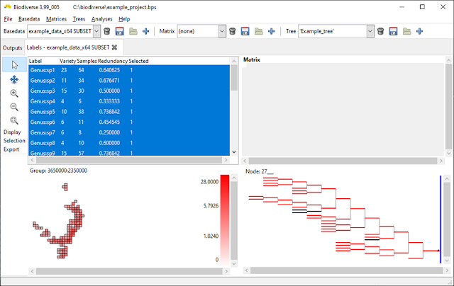
An example tree plotted using depth instead of length to show the individual branches.  The black branches are not in the basedata.  

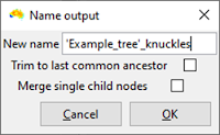
The tree trimming interface includes the option to merge single child nodes.  In this case it is not selected.   


The black branches from the previous screenshot have been deleted but one can see several branches that appear twice as long as the others. These are actually pairs of branches.


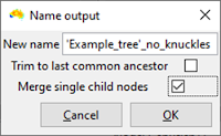
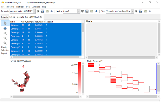
Repeating the process above but this time merging the single child (knuckle) nodes.  


In this case all the branches are the same length because all single child branches have been merged with their children.  


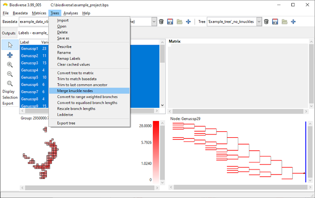
The examples above all use the tree trimming process, but if you have a tree that already has knuckles or forget to merge them then you can also merge the nodes directly from the tree menu.  


Direct access to the merging process.  

--------

Shawn Laffan

25-Nov-2022


For more details about Biodiverse, see http://shawnlaffan.github.io/biodiverse/  


To see what else Biodiverse has been used for, see https://github.com/shawnlaffan/biodiverse/wiki/PublicationsList 


You can also join the Biodiverse-users mailing list at https://groups.google.com/group/Biodiverse-users or start a discussion at https://github.com/shawnlaffan/biodiverse/discussions 


Tuesday, 25 October 2022

Biodiverse now calculates CANAPE for you

The CANAPE protocol is one of the analyses Biodiverse is most commonly used for (see examples amongst the list of publications using Biodiverse).  

The method, or protocol, was originally described in Mishler et al. (2014) and is conceptually simple.  Run an analysis that includes phylogenetic endemism and relative phylogenetic endemism, run those through a randomisation, and then categorise the results based on the significance score of the indices.  This process is described in more detail in previous posts here and here.  

The main issue with the approach to date is that the CANAPE classes are determined outside of Biodiverse using systems like a GIS, R code or a spreadsheet.  So while the process is conceptually simple, the actual implementation can all get a bit complex. Many users are not entirely sure which indices to pass through their functions, or even which lists to extract them from.  

As of Version 4 Biodiverse now calculates it for you.  This occurs automatically whenever an analysis has included the Phylogenetic Endemism and Relative Phylogenetic Endemism type 2 calculations.   (If you want it sooner than version 4 then it is in the development release 3.99_005, which was current at the time of writing.  See the downloads page for links).


Biodiverse now calculates the CANAPE scores when the requisite indices have been calculated, and a randomisation has been run.  Like many of the posts on this blog, this example uses the Acacia data set from Mishler et al. (2014).

How does Biodiverse store the results? 

The results are stored in a new list where the name is the randomisation output used followed by ">>CANAPE>>".  So for a randomisation called "rand" you would see "rand>>CANAPE>>".  The use of angle brackets might look a bit strange at first but makes the naming consistent with the other randomisation lists and simplifies the underlying code.

The CANAPE classes are stored in an index called CANAPE_CODE, with a numeric code indicating which of the categories a cell falls in.  Currently this code is 0 for not significant, 1 for neo-endemism, 2 for palaeo-endemism and 3 for mixed endemism.

Biodiverse also provides individual indices for neo, palaeo and mixed in the event a user only wants to see which cells are are in a specific class.  For example one might want to run a cluster analysis using only neo-endemism cells following the process described here.  


The same data as above but highlighting Palaeo-endemism cells in red.  All other cells containing data are in blue.  


Visualisation

A big advantage of generating CANAPE results within Biodiverse is that users can now explore the results using the functionality Biodiverse provides.  As an example, the next screen shot shows an exploration of the contribution of each clade on the tree in relation to the analysis groups (cells) (see more details about that process here and here).  

Each tree branch is coloured by the relative contribution of the clade subtending it to the PE score in the cell being hovered over (black dot in south-western WA).  This allows an understanding of which clade is driving the PE scores, and thus CANAPE, in a cell.  The visualisation process is explained in more detail here.  


Displaying the results in other systems

If you then want to use the plots as part of a map then they can be exported to an RGB Geotiff.  Details of how to do this are in another post but the next two screenshots show the start and end.  


What about a different colour scheme?


The colour scheme used is from Mishler et al. (2014) where neo is red (new is hot), palaeo is blue (old is cold) and purple is between blue and red on a colour wheel.  

If you prefer a different colour scheme then you can export the data as you normally would, for example as CSV files or as non-RGB geotiffs, and recreate the plot to your own tastes.  

Changing the colours within Biodiverse would be very useful and contributions are always welcome.

What about the Super class?  


The system does not currently generate the Super class.  It can be added if there is demand.  (Edit: It was added for Biodiverse Version 5).

Do I have to run a new randomisation analysis to see the CANAPE list?  


The CANAPE lists are generated at the end of any sequence of randomisations.  If you already have a randomisation analysis then they can be created by running one additional iteration.  

If you are concerned that your analysis is already at 999 iterations then all you lose is a bit of numeric neatness as there are now 1001 realisations in total instead of 1000 (one original plus all the random ones).  This is unlikely to make any meaningful difference once that many iterations have been run.

--------

Shawn Laffan

25-Oct-2022


For more details about Biodiverse, see http://shawnlaffan.github.io/biodiverse/  


To see what else Biodiverse has been used for, see https://github.com/shawnlaffan/biodiverse/wiki/PublicationsList 


You can also join the Biodiverse-users mailing list at https://groups.google.com/group/Biodiverse-users or start a discussion at https://github.com/shawnlaffan/biodiverse/discussions 


Sunday, 10 July 2022

Biodiverse now calculates indices for the variation in phylogenetic distinctness

Biodiverse has included calculations of indices from the phylocom system for several versions, specifically the Mean Phylogenetic Distance (MPD) and Mean Nearest Taxon Distance (MNTD).  The MPD is the average of the pair-wise distances between tree tips in a sample, where the distances pass through all the shared ancestors below the most recent common ancestor.  The MNTD is the average distance for each tip to its nearest tip in the sample.

There are many ways of slicing and diving a sample, and one of the development principles of Biodiverse is to provide more details rather than less.  Consequently there are also indices for the pair-wise root mean standard deviation (RMSD), minimum and maximum distances between a sample of tips on a tree.   

The min and max are simply the longest and shortest distances in the pairwise sample, so the distances between the most and least related pairs.  The RMSD is the square root of the mean squared distance and is a measure of the variability in a sample. It is analogous to a standard deviation but where the expected value (the mean) is zero, and follows the same formulation as the Root Mean Squared Error except a value of zero in RMSE means no error whereas in RMSD it means a zero distance between tips on the tree. 

However, the RMSD is not the variance and sometimes one is looking to see how a set of pair-wise distances is distributed around the mean.  This is where the Variance becomes useful, as first described by Warwick and Clarke (2001).

Biodiverse version 4 includes indices for the variance of the pairwise distances.  The index names are subject to change before then but for now follow the pattern PMPD1_VARIANCE, PMPD2_VARIANCE and PMPD2_VARIANCE, where the 1, 2 and 3 indicate unweighted (each tip counts equally), locally range weighted (tips count as many groups they occur in the neighbourhood) and locally abundance weighted (using the number of samples of each tip in the neighbourhood).  These are calculated by default when the relevant MPS and MNTD indices are requested. 

The variance indices are calculated with the other MPD and MNTD indices.  

Plotting is the same as for any index.  Some cells are blank because values are undefined when the sample contains only one tip, and therefore no path between tips.  Zero variances are where there are only two tips, and thus no variation.  


This is just a plot of the mean for comparison.  


But are the values significant?

A common approach to testing significance of the MPD and MNTD indices in the unweighted case is to use a resampling approach.  For each sample this generates a distribution of possible values under random resampling of the same number of tips.  More details are given in another blog post.  

The unweighted pairwise variance is also assessed in this way, with the index name using NET_VPD.  As with NRI and NTI, this is a z-score so values more extreme than +/-1.96 can be considered significantly higher or lower than expected.  

The resampling approach uses the same code as for NRI and NTI so the same sequence of resamples can be used across NRI, NTI and NET_VPD, although in Biodiverse version 4 this is only for NTI for non-ultrametric trees an exact calculation is used for NRI with any trees and for NTI for ultrametric trees.  This exact calculation avoids resampling and is much faster to run.  More details and references are in the same blog post referred to above).

The NET_VPD indices are also under the PhyloCom set.  Users can calculate the NET_VPD as well as the expected values used in its calculation.  


Values are z-scores.  At least three tips are needed to calculate the z-score as standard deviations are always zero for two tips and thus the z-score is undefined.


Control clicking on cells allow users to see the values for all indices that were calculated (within each output list, where SPATIAL_RESULTS is where most go).   


Shawn Laffan

10-Jul-2022


For more details about Biodiverse, see http://shawnlaffan.github.io/biodiverse/  


To see what else Biodiverse has been used for, see https://github.com/shawnlaffan/biodiverse/wiki/PublicationsList 


You can also join the Biodiverse-users mailing list at https://groups.google.com/group/Biodiverse-users or start a discussion at https://github.com/shawnlaffan/biodiverse/discussions