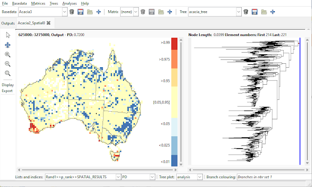
Randomisations in Biodiverse produce a range of outputs. These are kept in a range of lists, differing by name (see the help system).
One of the lists that is generated in the p-ranks. This is essentially the same as the P_ values in the main randomisation lists but where the low values account for ties so one can be sure the values represent the relative ranking of the observed value against those generated from the randomised data. For example, the significance of a low value should account for any ties.
The p-ranks were implemented a few years versions ago and are detailed in this blog post. Due to how the plotting was set up at the time, only values in the outer 10% of the distribution were retained. This helped understand which groups contained significant results without a major update to the display system but in the end was probably confusing. Now that the z-score plotting has been implemented the system has the infrastructure to handle the full range of values.
So what has changed?
Two things: the calculation of values and how they are plotted.
Note that the set of cells that can be regarded as significant using the standard alpha threshold of 0.05 for high or low values is unchanged. All that has changed is the number of cells with defined values and how they are displayed in the GUI.
The calculation
Put simply, all values are now retained. Any "P_" value less than 0.5 accounts to the number of ties. Expressed as pseudocode it is:
if P_index > 0.5
p_rank = P_index
else
p_rank = ((C_index + T_index) / Q_index)
where "index" is whichever index is being compared at the time.
This makes post-hoc calculation of compound indices like CANAPE easier (although remember that Biodiverse now does that for you).
The display
 |
| The p-rank plotting in Biodiverse version 4.2 and earlier works, but it is difficult to see which cells are in specific percentile bands. For example which of these cells is in the outer 5%? |
 |
| Indices in the p-rank lists are now plotted as percentile classes. Compare with the plot above. |
----
Shawn Laffan
27-Apr-2023
For more details about Biodiverse, see http://shawnlaffan.github.io/biodiverse/
For a list of some of the analyses Biodiverse has been used for, see https://github.com/shawnlaffan/biodiverse/wiki/PublicationsList
You can also join the Biodiverse-users mailing list at https://groups.google.com/group/Biodiverse-users or start a discussion at https://github.com/shawnlaffan/biodiverse/discussions
No comments:
Post a Comment
Note: only a member of this blog may post a comment.